Finding the best way to present a product or service online is not an easy job. When it comes to building a website that converts, even the best digital marketing experts don’t have a unique solution.
However, you can take some measures to make your website more appealing and boost your conversion rates.
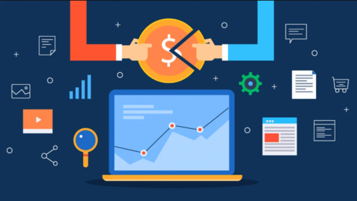
To make viewers do more than just visit your website, you will need a few tools and some good ideas. That’s why we compiled a list of our top 10 tips for designing a website that converts:
1. Consider your long-term goals
When building a website, you should know what you want to achieve in the long run. For example, when using call-to-action content, you should think about where you want to lead your viewers.
Furthermore, to make sure that your website converts, try to attract visitors who will interact with your page instead of just visiting it.
Having many visits to your page is great, but it will not bring many conversions to the website.
In case you want to redirect your customers to see more content, adding calls to action (CTA) in your content will be the key.
Before creating your website, take a look at some of the most important features it should have:
- Clear brand identity content
- The “why should you choose us” content
- Proof of credibility and integrity of your business
- Call-to-action buttons
- Constructive content and appealing design
2. Do the research – what is your target group?
Before building a website, you should think about the target group you want to reach.
Without doing research, you might attract people who will leave your page after a few seconds. You should consider a concept and design that will attract the particular audience that you want.
3. Planning a design layout for a website that converts
Besides content, the way you design your website makes a big difference in generating conversions. If you want your clients to be more eager to interact, you will need to make your content appealing.
Besides using quality textual content, here are some design hacks you might want to apply to your website:
- Group similar elements like colors and shapes. These will bring the visual focus on the subject you want to present.
- Use contrasting colors. When writing a statement or a short description of a product, consider using two or three colors. Too many of them will bring confusion, while writing in one color will not look clear enough.
- Choose a good font for textual context. If you are in doubt, do your research and see which fonts some other websites use. Visual impact can attract clients and help your brand stand out.
- Create a user-friendly navigation system. Scrolling bars and too many “menu” options can be confusing, so make sure to simplify these areas or avoid using them altogether.
4. Choose appealing photos
When it comes to the visual aspect of a website, a great selection of photos is of utmost importance. Of course, whether you use them on your page or not depends on the nature of your business.
Some minimalistic website designs attract the target group they are intended to. When choosing the photos for landing pages, consider implementing people’s faces. These photos have a stronger emotional impact on the viewer.
5. Optimize the content
The way you optimize your content will make all the difference.
First, using SEO will help you rank better on Google, especially if you target the right customer personas.
Second, SEO is a great way to connect content throughout the website. A landing page with optimized content will seem appealing and straightforward, and that is what will attract the most viewers and conversions to your website.
6. Keep your content short and direct
Once a customer or a future client reaches your website, they will want to see what they can get out of it.
Websites that are overcrowded with information can look like “too much work.” The last thing you want to do is to ask for “too much action” from your potential clients.
The best way to avoid this is to keep your content short, direct and simple. For example, if you want to sell a product, write about what makes it different from competitors.
On the other hand, when presenting a service on your website, you should attract your visitors’ attention to the CTA buttons. A clear message and a simple description are usually the best ways to do that.
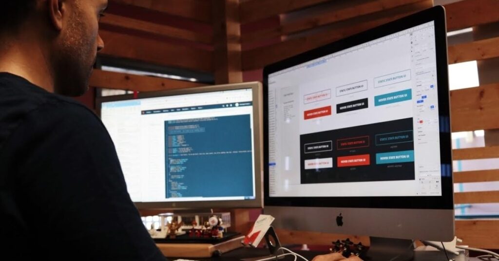
7. A simpler design can be a better solution
Even if you know exactly how you want to present your product or service, your website’s design will have a bigger say.
Basically, the visual aspect of the page is what attracts viewers first. This is why you should make it simple and effective.
If designing your website seems daunting, it’s best to hire professionals. Hiring locals is generally best, especially if you want to avoid potential communication problems or timezone issues.
So, if you live in Chicago, check what a design agency in Chicago offers and discuss your plans in detail.
There are often too many ideas for a visual presentation when thinking of a website that converts.
Keep in mind that the colors and fonts you use should also reflect your brand. If your website becomes successful, your clients will remember the visual appeal of your company.
8. Focus on CTA content
The call-to-action buttons are the main component that makes your visitors interact. CTA messages and buttons are used to bring clients directly to the product or service you’re selling.
For example, if you want to make people buy or order your product on the go, a CTA button can bring them to the mobile app installation page. If you are working with experts for mobile app development, make sure to discuss this website navigation plan.
Another good example of CTA is an online quote offer. If you are offering a service, a “get-your-free-quote” button can be the most effective feature on your website.
9. Avoid friction points and overcrowding
Once you combine all of your ideas and put them into making a website that converts, consider that having too many options on a landing page can confuse your visitors. Moreover, this concept can drive away potential customers as they will not know what they’re looking at.
An efficient website is there to show your visitors that your product is easy and simple to buy.
The less work a visitor has to put in, the more chances there are they will act. That is why you should make sure to avoid friction points and overcrowding your website page.
10. Give it time to work
After building an appealing convertible website for your business, it might take some time for it to show results.
Even the most successful web designers can’t calculate your conversion rates in advance.
If you believe in your idea and convey a clear message to your visitors, your website will bring success sooner than later.